I really wasn’t entirely satisfied with my first attempt at building a Random Quote Generator on Free Code Camp. It was ugly, and the quotes were too long so I didn’t bother to implement the “tweet” functionality. It just didn’t make any sense to do that.
So after I finished with the Pomodoro Clock Project, I felt a strong desire to revisit that project and start over with a different approach.
I wanted a more interesting design with a few animations and I had this idea of putting the quotes into different categories so that users can view quotes from their favourite categories.
My exams were over so I had enough time on my hands to finish it off.
Logic
I settled on eight categories for the quotes and collected 25 quotes for each one. Each category was an array of objects with quote and author properties so that I could retrieve each one easily.

Then I made a function to put the quotes in the HTML once the next quote button is clicked and a similar function for the “previous quote” button.

If you look at the code you will see that the quotes aren’t generated randomly at all but instead they iterate from the first to the last and back again. That’s an intentional design choice I made.
Design
What annoyed me the most about that first attempt was not even really how it worked, but how it looked. So the design was what I concentrated on for the most part on this project.
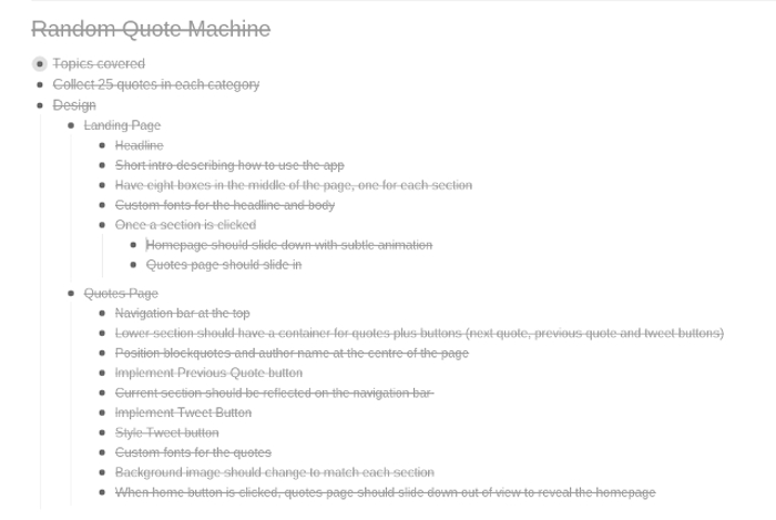
The first thing I did was to list out all the things I wanted my app to do and how I wanted it to look. I’ve learnt over time that the best way to approach anything is to break it down into simple actionable steps so that is what I did here using Workflowy.

I’ve always used Skeleton CSS boilerplate whenever I want to make a grid based layout so I continued with it for this one also.
This time though, I used the Sass version which made it easy to change a few variables and customise it a bit without touching the original files.
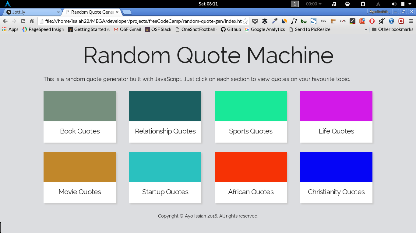
Once that was in place, I commenced work on the design of the landing page. In my mind’s eye, I wanted a 2x4 grid with cards for each section and a headline at top. That was easy enough.

Bam! I had my grid in place. The next thing was to figure out how I was going to style the quotes page and use animations to switch between both pages.
The quotes page took me a bit more time to finish. I had a navigation bar at the top for switching between sections and box in the middle where the quotes would be displayed. The buttons to show the quotes were at the bottom.
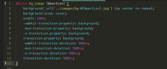
An idea that popped into my head at this point was to change the background image as the user moves between sections. The background image was to correspond with the featured image in the cards on the home page.
I also wanted the change to be smooth with subtle animations so I used the CSS transition property for this purpose and it did work well on Chrome but I couldn’t get it to work on Firefox (if anyone know how to fix this, please let me know).

Once I had both layouts sorted, it was time to link the two pages with an animation. My first thought was to use CSS animations but I didn’t get anywhere so I sought out jQuery animations instead. After some experimenting, I found what I wanted. The slideUp() and slideDown() functions were perfect for what I needed.
Basically, once you click on any of the sections on the homepage, the quotes page will slide into view and you can view quotes from the different sections. Similarly, when you click the home button on the navigation bar, the page slides down to reveal the homepage.
So that was that.
All I did from that point was to replace the placeholder images with real images and use some Google fonts to spruce things up. Lastly, I did the tweet button.
You can view the final version on CodePen.
Lessons Learned
In the course of working on this project I learned a few valuable lessons:
-
In some cases, using background images can give you more control and more flexibility with images of different height because you can set
background-size: coverand it won’t overflow the container. In addition, you can create some cool hover effects like I did with the featured images on the landing page. I didn’t always know this but someone on the CodeNewbie Slack group pointed this out to me. -
I also learnt how to break down my Sass files into partials and import them into the main stylesheet. This helps for organisation and makes fixing things easy. I have a working architecture I’m using and it’s not perfect but I’ll improve on that over time.
I’ll love to hear your thoughts on my approach and what things I could improve on so a comment or two will be greatly appreciated.
Next up
I’ll be working on the “Show the Local Weather” project this weekend and I hope to have it done by Sunday. This will be my first real experience with using an API and I hope I get it right quickly enough.
I will write a similar post on that project next week so keep an eye out for that one.
If you want to reach out or connect with me, you can find me on Twitter or email me.